App blocks in the Checkout Editor
In Shopify’s Checkout Editor, Checkout Buddy offers three app blocks. An app block is a slot that displays one or more of the blocks you created in Checkout Buddy. What it shows is controlled by its settings and by each block’s display rules.
| App block | Use it for |
|---|---|
| Checkout Buddy | Every block on the Information, Shipping, and Payment steps, including under line items and shipping options |
| Checkout Buddy - Cart Line Item | Cart line editor, Line item upsell, and Line item text under each product. It supports extra button styles for the cart line editor. |
| Checkout Buddy - Thank You & Order Status Page | Content blocks on the thank you and order status pages. See thank you and order status pages. |
Where to place blocks
Section titled “Where to place blocks”Most blocks work anywhere. A few only make sense in specific locations:
| Location in checkout | Good for |
|---|---|
| Header, footer, or any block slot on a step | Banners, text, trust badges, images, FAQ, reviews |
| Contact section and delivery address | Form fields, SMS consent, address validator, address autofiller |
| Above or below shipping methods | Delivery notes, date pickers, shipping messages |
| Under each shipping option | Text that should show under one specific shipping option. See shipping method description. |
| Above or below payment methods | Payment messages, terms checkboxes |
| Under each line item (order summary) | Line item text, Line item upsell, Cart line editor |
| After the line items, or around the discount field | Cross sells, progress bars, discount buttons |
| Above the checkout buttons | Terms checkboxes, last-chance offers |
Blocks placed under each line item or shipping option are shown once per item or option. Each copy checks the block’s display rules on its own, so rules like Target line item tags can show a block under some products and not others. See rules for a specific line item.
Checkout Buddy app block settings
Section titled “Checkout Buddy app block settings”
Which blocks to show
Section titled “Which blocks to show”| Setting | What it does |
|---|---|
| Fixed block ID | Only blocks with these IDs can show here. Separate several IDs with commas; at most one of them shows at a time. Leave it empty and any of your enabled blocks can show. |
| Multiple block IDs | Show several blocks here at once, stacked in the order you list them. Replaces Fixed block ID when both are filled. Analytics don’t track these blocks individually. |
Both settings still respect each block’s status, markets, and display rules. A block listed here won’t show if it’s disabled or its rules don’t pass. See which block shows.
Tracking
Section titled “Tracking”| Setting | What it does |
|---|---|
| Disable custom attributes | Stops Checkout Buddy from adding its tracking data (__buddy_data on the order and _buddy_data on line items it adds). |
Appearance
Section titled “Appearance”These settings style the blocks shown in this app block. Colors and fonts come from your checkout branding.
| Setting | Options | Applies to |
|---|---|---|
| Number of products shown | 1–10 | Cross sells, when the block doesn’t set its own number |
| Enable pagination | On / off | Cross sells: turns on page arrows even if the block doesn’t. Reviews: shows one review at a time with arrows. |
| Divider position | None, Top, Bottom, Top and bottom | Dividers around the block |
| Image size (pixels) | Number | Image blocks, product images, and images in icon and feature highlight blocks |
| Heading size | Small, Medium | Cross sell headings |
| Subheading size | Small, Base | Block subheadings |
| Subheading position | Top or bottom, left, center or right | Block subheadings |
| Subheading emphasis | None, Italic, Bold | Block subheadings |
| Heading/subheading appearance | Default, Accent, Subdued, Info, Success, Warning, Critical | Heading color. Doesn’t change a banner’s own title. |
| Text size | Small, Base | Body text |
| Text position | Left, Center, Right, Top, Bottom | Text alignment in text, icon, and trust badge blocks |
| Text appearance | Default, Accent, Subdued, Info, Success, Warning, Critical, Bold, Italic | Body text |
| Call to action appearance | Default, Primary, Secondary, Plain, Critical, Monochrome | Buttons in cross sells, discount buttons, and contact info. A cross sell’s own Button style takes priority. |
| Misc. appearance | Show titles for single variants, Show border around checkboxes, Position text and icons left | Small layout tweaks |
Behavior
Section titled “Behavior”Misc. features has two options:
- Hide component product if already in cart: Cross sells in this app block hide products the customer already has in their cart.
- Disable component refresh: Normally a block re-checks its display rules as the customer changes their cart, address, or shipping method. This option keeps the first block chosen for the whole visit, even if its rules stop passing.
Checkout Buddy - Cart Line Item settings
Section titled “Checkout Buddy - Cart Line Item settings”This app block only shows Cart line editor, Cart line editor (simple), Line item upsell, and Line item text blocks. Place it under the line items in the order summary. Its settings are Fixed block ID, Multiple block IDs, Disable custom attributes, Text size, Text position, Text appearance, and Misc. features. They work the same as above.
Use it instead of the main app block when you want the cart line editor’s button styles or add-on button. See cart line editor.
Allowing a block to stop checkout
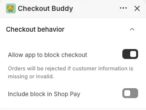
Section titled “Allowing a block to stop checkout”Required form fields, field validation, the address validator, and banners set to block checkout can only stop a customer from continuing if you allow it. In the Checkout Editor, open the app block’s settings and turn on Allow app to block checkout under Checkout behavior.
If that option is off, the field still shows but customers can continue without filling it in.