
Layouts for product offers
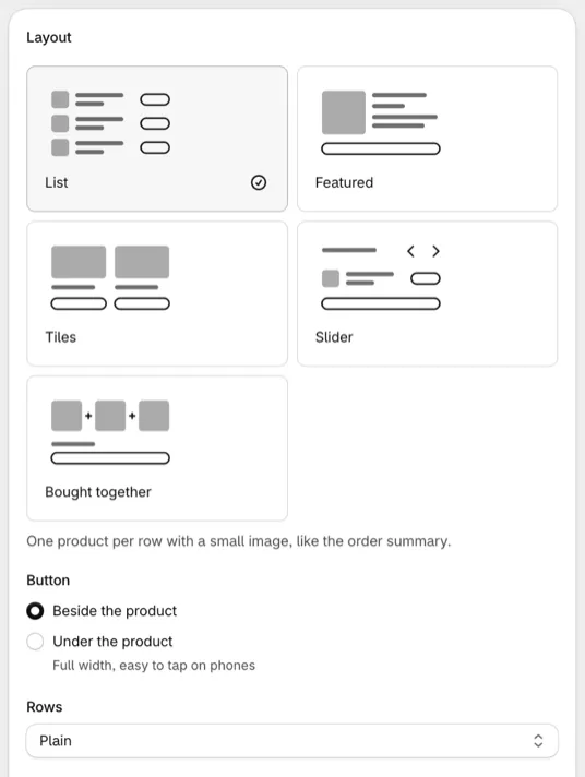
The Layout card in the Product offers editor sets how an offer looks, in checkout and on product and cart pages. Pick a layout from the sketches, then its options. The Preview follows your choices, and your store’s checkout colors, fonts and corners apply in checkout.
Requires: in checkout, Shopify Plus and the Buddy plan. On product and cart pages, see plans.
On product and cart pages, every layout is drawn as it is in checkout, with your theme’s fonts and colors, and Buttons on product and cart pages sets the buttons’ color and corners. See button looks. The Preview has a Product page tab that shows the offer as those pages draw it. Subscriptions don’t show there.
Older product offers keep their own layouts. See older layouts for which new layout matches each one.
Choose a layout
Section titled “Choose a layout”The layouts you can pick depend on the offer type. Only the chosen layout’s description shows under the sketches.
| Layout | What it looks like | For | Options |
|---|---|---|---|
| List | One product per row with a small image, like the order summary. | Upsells, gifts | Button (Beside the product or Under the product), Rows (Plain, Lines between or In a box), Image size (Small image, Regular image or Large image, beside Image) |
| Featured | One product at a time with a large image and its description, like a small product page. | Upsells, gifts | Image size (Regular image or Large image, beside Image) |
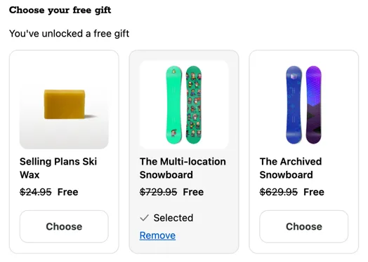
| Tiles | Products side by side with the image on top. Good for products people choose by look. For gifts the buyer picks: gifts side by side to choose from. | Upsells, gifts | Per row (2 or 3) |
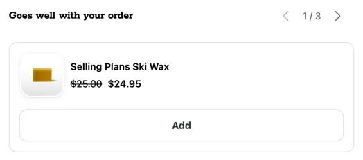
| Slider | One product at a time in little space. Buyers move with arrows, or swipe on phones and Android tablets. | Upsells, gifts the buyer picks | Buyers move with (Arrows or Swipe on phones and tablets) |
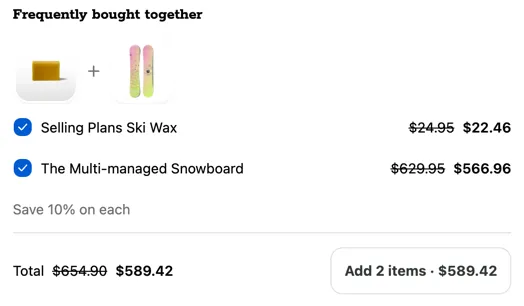
| Bought together | Products shown together with a total and one button that adds them all. | Upsells | Products in the bundle (1 to 20, 3 to start) |
| Line | A checkbox or switch at the start of each add-on’s row. | Checkbox upsells | Buyers tick (A checkbox or A switch), Image size (Regular image or Large image) |
| Card | Each add-on in its own box, with the price and the checkbox or switch at the end. Good for shipping protection. | Checkbox upsells | Buyers tick (A checkbox or A switch), Image size (Small image, Regular image or Large image) |
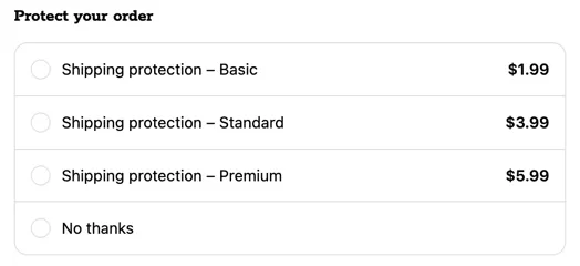
| Choose one | Buyers pick one option or No thanks. Nothing is picked to start, as Shopify requires for paid add-ons. | Checkbox upsells | The No thanks text, in the Text card |
Products shown at a time
Section titled “Products shown at a time”Products shown at a time, for upsells and gifts the buyer picks, sets how many products show before buyers page to the rest: 2 to start in List, 1 in Featured and Slider, and one row in Tiles. You can set 1 to 20.
- When there are more, centred arrows under the products page through them, around a count such as “1 / 3”. The arrows stop at the first and last page.
- Slider’s arrows sit on the heading’s line, and with Swipe on phones and tablets, phones and Android tablets swipe through all of them. iPads and computers show the arrows.
- Automatic gifts and checkbox upsells show every product.
- Product and cart pages page the same way. An upsell pages through up to 10 products there.
Button style
Section titled “Button style”Button style, for upsells and gifts the buyer picks, sets how the Add, Choose and Bought together buttons look in every layout: Secondary, Primary or Plain link. Buttons start as Secondary, which Shopify recommends in offers so the Pay now button stands out. The buttons of automatic gifts and checkbox upsells stay Secondary.
In checkout, button colors are in Branding: open the offer’s area, such as Main content or Order summary, then More options. On product and cart pages, see button looks.
Bought together
Section titled “Bought together”- Every product starts ticked, but nothing is added until the buyer taps the button, which shows the count and the total, such as “Add 2 items · $62.98”.
- It adds one of each, once: there’s no quantity picker or subscription.
- Its products are the first ones of the highest tier the cart has reached, up to Products in the bundle. With Shuffle the products on, it keeps the same products for the whole checkout.
- A product already in the cart from elsewhere shows “In your cart”, unticked and left out of the total.
- A % off discount applies to each product, not to the set.
- For a discount on the whole set, such as “Buy together, save 10%”, the Bundle discount card under Offers creates a Combo discount for it. See bought together.
- On a product page, the set starts with This item, the product being viewed.
- With fewer than 2 products that can be added, or while suggesting products that reach a goal, it shows as List.
Choose one
Section titled “Choose one”Choose one lists one option for each variant offered, then No thanks. Options show without images. Over 10 options show as a list of checkboxes where only one can be ticked.
How each layout looks
Section titled “How each layout looks”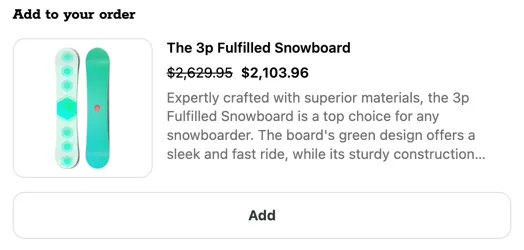

Start collapsed
Section titled “Start collapsed”Tick Start collapsed, under Behavior, to show only the heading until buyers open it, with a count such as “(3)”. It works with every layout, and it’s off to start.
- A progress line and bar stay visible while it’s closed.
- A collapsed offer counts a view in Analytics once it’s opened, or once buyers see its Next reward box, which stays outside the fold.
- An automatic gift is still added while the offer is closed, and shows in the order summary.
- Give the offer a heading, since the heading is what buyers tap. Without one, buyers open it from “See offers”.
Show progress as
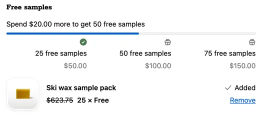
Section titled “Show progress as”For offers with tiers and Show progress toward the next tier on, choose how progress looks:
| Style | What it shows |
|---|---|
| Bar | A line of text and a bar. |
| Bar with rewards | The bar, with each reward marked under it. |
| Steps | Every tier as a step with what it gives. Best with 3 or more tiers. |
| Next reward | The next reward in a box, locked until the cart reaches it. |
- Checkbox upsells can use Bar and Bar with rewards only.
- While suggesting products that reach a goal, the offer uses Bar.
- With one tier, Bar with rewards and Steps show as Bar.
Each product
Section titled “Each product”| Setting | What it does |
|---|---|
| Image | Shows the product image. In List, Featured, Line and Card, a size beside it: Small image, Regular image or Large image. Featured and Line have no small size. |
| Variant picker | For products with several variants offered. In every layout, a product with options shows one short line under its price, such as “Color: White · Qty 1”, that opens the pickers when tapped. Choose one lists each variant as its own option instead. |
| Variant name when only one is offered | Shows the variant’s name, such as “Large”, when you offer one variant. |
| Quantity picker | Upsells: buyers choose how many to add. |
| Vendor | Shows the product’s vendor. |
| Star ratings | On for new offers. Your reviews app’s rating and review count under the product’s name. Not in Bought together or Choose one. See star ratings. |
| The product’s description | Unless you write one for the product in Offers. On to start in Featured, which shortens it to about 200 characters. Tiles shorten it to about 100. |
| Subscriptions | Upsells with manually selected products that have selling plans: One-time purchase only, or Buyers can choose a subscription. Subscription-only products always show on their plans, in upsells and checkbox upsells with manually selected products: the first plan is picked, and buyers can switch when there are several (Choose one offers the first). B2B buyers see no subscriptions, as Shopify doesn’t sell them on B2B orders. |
When they’re on, the Quantity picker and Subscriptions show in every layout that has them, on phones and computers alike. In Tiles and Slider, where products sit side by side in little space, the options read in short words, such as “White · One-time · Qty 1”, and their fields are labelled “Color”, “Purchase” and “Qty”.
Once a product is in the cart
Section titled “Once a product is in the cart”For upsells, choose what happens once the product is in the cart, whether from the offer or from your store:
- Keep it, marked Added
- Hide that product
- Hide the whole offer
Bought together doesn’t have this setting: products the buyer already has show “In your cart”.
Behavior
Section titled “Behavior”| Setting | What it does |
|---|---|
| Buyers can remove the gift | Automatic gifts. Adds a Remove link. A removed gift shows with an Add button instead of coming back. |
| Only one can be ticked | Checkbox upsells in Line and Card. Ticking one unticks the others. |
| Shuffle the products | Once per checkout, then the order stays, even after a reload. Product and cart pages don’t shuffle: products keep your order. |
| Border around the offer | Draws a border around the whole offer. |
Devices
Section titled “Devices”Upsells and checkbox upsells can show on Every device, Mobile and tablet only or Desktop only. The device comes from the buyer’s browser, so resizing a desktop window doesn’t change it. Gift offers have no device setting.
Older layouts
Section titled “Older layouts”Older product offers and Checkbox product offers keep their layouts. To make the same look with Product offers:
| Older layout | In Product offers |
|---|---|
| Linear | List |
| Compact 2 | List, with Button set to Under the product |
| Classic, Compact | Featured |
| Compact (columns) | Tiles, 2 per row |
| Checkbox | Line |
| Switch, Checkbox V2, Switch V2 | Card |
| Allow only one product offer to be selected at a time | Only one can be ticked, or Choose one |
| Enable pagination, Show page count | Every layout that pages shows arrows and a count |
Things to know
Section titled “Things to know”- Upsells and checkbox upsells always show the price. Shopify requires a paid item’s cost to show.
- Not carried over from older layouts: heading and title sizes, image sizes in pixels, and the image linking to the product page. Your checkout branding sets fonts, sizes and corners.
- Tiles at 3 per row fit only a wide main column. Elsewhere they show two per row. Shopify suggests showing two offers at a time.
- List on a narrow screen: a row narrower than about 300px, such as on a small phone, puts the button under the product, full width.
- Several offers in one app block stack, each with its own layout, pager, progress and collapsed state.