
Content block
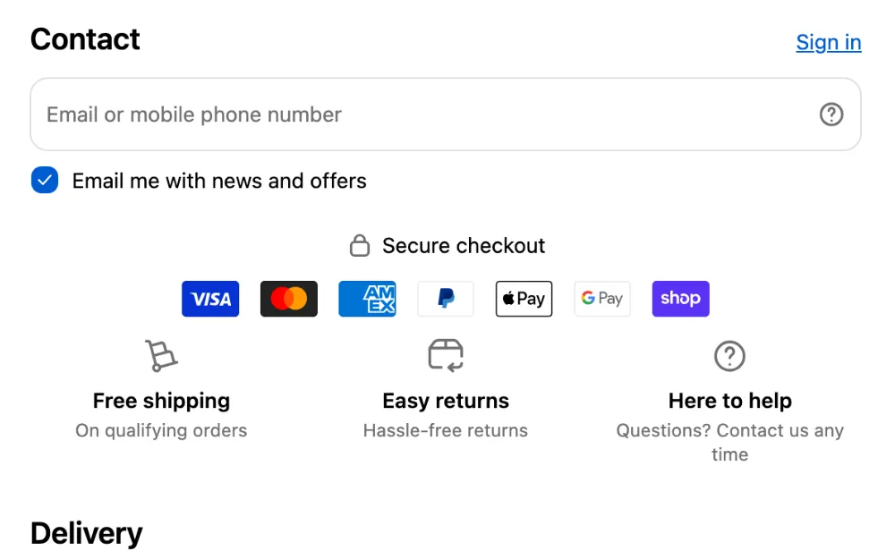
A Content block puts words and pictures in checkout: a banner, a line of text, trust badges, your benefits, an FAQ, buttons, or space between other blocks. One block can hold several of these parts, one under the other, such as a heading, payment logos and a line about returns.
Requires: Shopify Plus. Available on the Free plan. See plans.
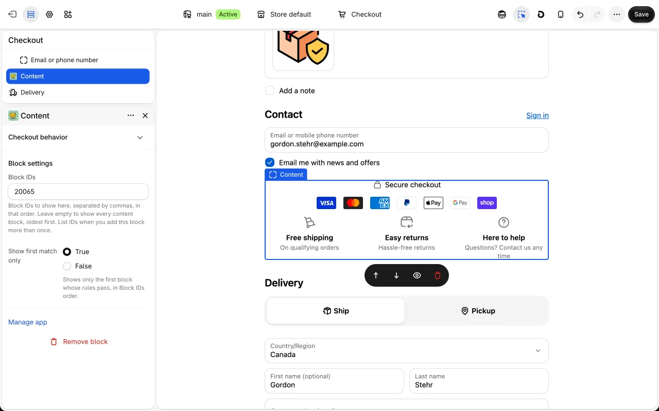
Content blocks show in their own app block, Content, which you add in Shopify’s checkout editor. In Customizations they have the type Content block. Progress bars (such as a free shipping bar), Reviews, What happens next and automations made since the Content block show in the Content app block too.
Add a content block
Section titled “Add a content block”- In Checkout Buddy, go to Customizations → Content → Create customization and pick a card: Banner, Text, Image, Trust badges, Benefits, FAQ, Contact info or Spacer / Divider. Discount buttons is on the Discounts tile. Each card opens the same editor with its parts filled in. A card with templates asks first: Start with the card, or a template.
- Give the block a Name. Only you see it.
- Change its parts under Parts, how it looks under Look, and who sees it under Who sees it. The Preview shows the block at a phone’s, the order summary’s and a computer’s width, in each of your store’s languages, with live values filled in from a sample cart.
- Under Status, turn on the switch so it reads Published, and save. New blocks start as Draft, which only shows in the preview.
- In Shopify’s checkout editor, add the Content app block where the block should show, and save the editor. Where it shows has a link to the editor, and warns you while the app block isn’t in your live checkout.
You don’t need to type an ID anywhere: a Content app block with empty Block IDs shows every published content block whose rules pass. To show a block in one place only, see which blocks an app block shows.
Which blocks an app block shows
Section titled “Which blocks an app block shows”The Content app block has two settings in Shopify’s checkout editor:
- Block IDs: “Block IDs to show here, separated by commas, in that order. Leave empty to show every content block, oldest first. List IDs when you add this block more than once.”
- Show first match only: “Shows only the first block whose rules pass, in Block IDs order.”
So:
- Block IDs empty: every published content block whose rules pass shows, oldest first, one under the other. There’s no random pick: if three blocks pass, buyers see all three.
- Block IDs listed: only those blocks, in that order, each when its rules pass. A block’s ID is under Status in its editor once you’ve saved it, and in the ID column on Customizations.
- Show first match only ticked: only the first block whose rules pass shows. For example, with Block IDs
12, 15, 9and a cart that passes 15’s and 9’s rules but not 12’s, buyers see only 15. Use it for “one of these messages, depending on the cart”. It doesn’t change automations, which run whatever it says.
If you add the app block more than once, list IDs in each, so no block shows twice.
Progress bars, Reviews and automations show (or run) in app blocks in checkout’s sections when Block IDs is empty, not under each item, shipping method or pickup location. What happens next also shows under each shipping method and pickup location. Listed in Block IDs, any of them shows wherever that app block is.
Where to place it
Section titled “Where to place it”The Content app block goes everywhere the Checkout Buddy (v1) app block can:
| Place in Shopify’s checkout editor | Good for |
|---|---|
| A step’s main column, or a section: the header, contact, before or after the shipping address, shipping methods, pickup locations and pickup points, before or after the payment methods, above the pay button, the order summary, around the discount field, the footer | Anything: banners, text, trust badges, benefits, FAQ, buttons, progress bars, reviews |
| Under each item in the order summary | A note under some items, with This item rules and the item’s values, like its SKU or a metafield |
| Under each shipping method | A note under one method, with This shipping method rules. What happens next shows that method’s dates there. |
| Under each pickup location | Store hours or directions per location, with This pickup location rules and {{ pickupLocation.name }} |
Shopify has no place for apps under each payment method or at the billing address. For a note about one payment method, place the block before or after the payment methods and give it a Payment method rule: it appears and disappears as the buyer switches.
Sections on more than one step, such as the order summary, show on every step. A block in a step’s own section shows only on that step.
A block shows its parts from top to bottom. Click Add part to add one, open a row to change it, and use the arrows to move it up or down. Each row can be duplicated or removed.
| Part | What buyers see |
|---|---|
| Text | A heading and paragraphs, with bold, links and live values like the amount left to free shipping |
| Banner | Shopify’s colored message box. It can open on a tap, be closed by the buyer, or stop checkout. |
| Image | One picture, with a link if you like |
| Trust badges | Payment logos and your own seals, like a security seal or a guarantee badge |
| Benefits | Short promises with an icon or picture, like free shipping and easy returns, in a row, a list or cards |
| FAQ | Questions that open to their answers |
| Buttons | Buttons or links that open a page, email you, call you, apply a discount code, copy text, or show more text in a window |
| Spacer | Empty room or a line |
See parts for every setting.
Cards and templates
Section titled “Cards and templates”Each card opens the editor with its parts filled in. Its title becomes the block’s name.
| Card | Starts with | Templates |
|---|---|---|
| Banner | A Banner | Order by 2 PM, ships today, Holiday delivery deadline, Weekend orders ship Monday, Pre-order notice, Final sale, Sale items notice, Cash on delivery fee note, Duties and taxes notice, Duties included, Wholesale notice |
| Text | A Text part | Welcome back, {{ firstName }}, Subscription details, Pickup instructions, Store hours under each pickup location, Local delivery times, Note under express shipping, Size guide, Terms and conditions |
| Image | An Image | |
| Trust badges | Visa, Mastercard, American Express, PayPal, Apple Pay, Google Pay and Shop Pay logos | Secure checkout |
| Benefits | One benefit, Secure checkout | Why shop with us, Returns and warranty, Highlights with pictures, Picture beside a heading |
| FAQ | A “Frequently asked questions” heading and one question | Shipping and returns questions |
| Contact info | “Need help?” text, with Email us and Call us links | Need help? |
| Discount buttons | “Save on your order” text and an Apply code button | First order code |
| Spacer / Divider | A Spacer |
Templates come with their rules set, such as Order by 2 PM, ships today, which shows on weekdays until 2 PM in your store’s time zone. Change the words, times and amounts before you publish. What only you know, such as the markets in Duties included or a location’s name in Store hours under each pickup location, starts empty, and the block shows to nobody until you fill it in. Note under express shipping shows in a Content app block you add under each shipping method.
Benefits replaces the older Icons with text and Feature highlights cards: searching for either finds it.
The Look card sets how the whole block looks:
| Setting | What it does |
|---|---|
| Box around the block | None, Outline or Shaded |
| Alignment | Left or Center. Parts without their own alignment follow it. |
| Room between parts | Small, Medium or Large |
| Room above, Room below | Space around the block, from None to Extra large |
| Opens on a tap | Buyers tap a Title to open the block, like an FAQ question. Tick Starts open to show it open; buyers can still close it. |
| Show on | Phones and computers, Phones only (tablets count as phones) or Computers only. Shopify’s checkout editor always shows it. |
Colors and fonts come from your checkout branding. Shopify doesn’t let apps add their own colors, fonts or CSS in checkout, so the choices are the ones its checkout offers: tones such as Info, Success, Warning and Critical, subdued text, outlines and shaded boxes.
Who sees it
Section titled “Who sees it”Under Who sees it, choose Every checkout, or Only checkouts that match the rules and add conditions: the cart, items, discounts, the customer, the address, delivery, payment, language, market, date and time, and more. A line above them sums them up, such as “Shows when the shipping country is US.”
Rules are checked again whenever checkout changes, without a reload, and a time rule changes the block at its minute. See Content rules.
Live values in text
Section titled “Live values in text”Text can show values from the buyer’s checkout between {{ }}, such as the cart total, the amount left to free shipping or a ship-by date. The Insert value button above each text field writes the common ones for you, and the field shows what the value reads with a sample cart. See live values in text.
Translations
Section titled “Translations”Under Translations, pick a language and translate everything buyers read: headings, text, titles, button labels, questions and answers, link addresses, and picture links and descriptions, so a picture can change per language. Leave a field empty to show your default text. The Preview’s language picker shows each language.
Translations stay with their part when you reorder or add parts.
Discount codes, email addresses, phone numbers, icons and payment logos aren’t translated. For a different one per language, make one block per language with a Language rule.
Words Checkout Buddy adds itself, such as Applied, Copied and Close, come in English and French.
Duplicate and delete
Section titled “Duplicate and delete”Duplicate, at the top of the editor, makes a copy as a draft, named with “(copy)”. Delete content block, at the bottom, removes the block from checkout right away. To hide a block without deleting it, switch its Status to Draft and save.
- Shopify Plus. Shopify shows app blocks in checkout only on Shopify Plus stores. Development and Plus sandbox stores work too.
- Free plan. A content block can be the Free plan’s one customization, whatever its parts. That includes Text, which needed the Buddy plan as an older block.
- Progress bars are free unless their goal is cart weight. Reviews and What happens next are free.
- Automations need the Buddy plan.
- Buddy plan: as many as you like.
See plans and billing.
Your older blocks
Section titled “Your older blocks”Blocks made before the Content block keep working exactly as before, with their own editor, in the Checkout Buddy (v1) app block. Nothing moves on its own, and nothing changes for buyers.
Which kind is my block?
Section titled “Which kind is my block?”| Content block | Older blocks | |
|---|---|---|
| Made | With the Content block editor | Before the Content block |
| In Customizations | Type Content block, kind Checkout · Content app block | Their own type, such as Banner or Trust badges, kind Checkout · Checkout Buddy (v1) app block |
| In the editor | Cards such as Parts, Look and Who sees it | One form per block type, with Conditions |
| In Shopify’s checkout editor | The Content app block, with Block IDs | The Checkout Buddy (v1) app block, with Fixed block ID or Multiple block IDs |
| When several pass | All show, one under the other, or only the first with Show first match only | One is picked at random, unless the app block uses Multiple block IDs |
| Rules | Content rules, checked again on every change and on the minute | Conditions; a few only re-checked when something else changes |
| Amounts in other currencies | Converted at Shopify’s rate | Compared as typed |
| Day and time | Your store’s time zone | The buyer’s clock |
| Look | Each block’s own Look and part settings | The app block’s appearance settings |
| Translations | In the editor | App settings → Translations |
| Data on the order | None | __buddy_data, unless turned off on the app block |
Progress bars, Reviews and What happens next blocks have the same type either way: the Kind column on Customizations says which app block each one is in.
Move an older block to the Content block
Section titled “Move an older block to the Content block”There’s no button that moves a block: make a new one, then turn the old one off.
- Create a content block from the same card, such as Banner, and copy over its words, pictures and links. Most
{{ }}values and formatting work as they are. See coming from older blocks. - Add its rules under Who sees it. They have new names: see coming from older conditions. The old Markets setting is now a Market rule, and the old devices setting is Show on in Look.
- Publish it, add the Content app block in the same place in Shopify’s checkout editor, and save the editor.
- Check it in checkout, then open the older block and turn off its Status. If the Checkout Buddy (v1) app block now has nothing left to show, remove it from the checkout editor.
The old app block’s appearance settings, such as Subheading size or Text appearance, don’t carry over. Set the look in the block’s Look card and part settings.
What changed for new blocks
Section titled “What changed for new blocks”| Older block | For new blocks |
|---|---|
| Banner, Text, Image, FAQ, Spacer / Divider | The same cards, now content blocks |
| Trust badges | The Trust badges card, for logos and seals. Words such as “Secure checkout” go in a Text part or a benefit. |
| Icons with text, Feature highlights | The Benefits card, with a Row, List, Compact or Cards layout |
| Contact info | The Contact info card: text with email, call and page buttons |
| Discount buttons | The Discount buttons card: buttons that apply a code, now with Applied and refused messages |
| Apply discount code, Apply checkout attribute, Line item remover | Automations: Add a discount code, Set a cart attribute, Remove items |
| Remove discount code | Not offered for new blocks. Code rules refuse codes by your own rules, with your message, in every checkout. |
| Address autofiller | Not offered for new blocks. Shopify does this better: B2B company locations fill in the company’s address, local pickup covers a venue or school, and logged-in customers get their saved addresses. |
SMS consent, the Address validator, Line item text and Apply line item attribute aren’t part of the Content block: they’re still made as before. SMS consent, the Address validator and Apply line item attribute are only offered to stores that installed Checkout Buddy before November 11, 2026.
The pages for older blocks are under Older content blocks in this help center, such as Banner (older).